Simplifying Grocery Shopping
Responsibilities:
User Research, Design System, Ideation, Prototyping, Handoff
My team:
Product Manager, Product Designer, UX Researcher, Engineer
Duration:
12 Weeks
Project Overview
Near is a Chinese on-demand grocery delivery start-up that promises to deliver groceries within 30mins or less.
Near is looking to expand its market by targeting senior users, who are often overlooked, and creating a satisfying product experience that will stand out against other competitors
I worked with Near to redesign the experience of browsing products, selecting items, and checking out
The Challenge
First, allow me to show you some of the problems that the product was facing before the redesign. Below are the three main screens that users usually navigate through in the previous design.
The previous interface, particularly, the home page, was filled with ads and promos that disrupted the product experience and gave users anxiety as soon as they opened the app. However, the frustration did not stop there; users had complaints over some of the design components that further confused them.
The senior users, which form about 18% of Near’s user group, suffered the most in the midst of these poor designs. They had trouble understanding the product flow and reading the texts on the screen because of the text sizes.
The core of these frustrations comes from the product selection page: its lack of prioritization of information and multiple menu bars made the product browsing experience inefficient and inconvenient.
It’s not hard to see how this could be troublesome for customers, especially if they are not avid tech users. These menus all interact differently and some of them display overlapping or redundant information.
The Goals
How might we offer a simple and direct shopping experience for users who are previously neglected?
More specifically, the redesign needs to:
Streamline confusing product flows
Re-prioritize information architecture
Establish a clear and accessible interface, especially for senior users
Create designs that offer customers a refreshed product experience
The Product
Main Page & Product Selection Menu
Opportunity
In the previous interface, users were distracted by the ads and confused by the overall informational architecture. From research and analysis, it was clear that the opportunity for establishing a cleaner and easier design was very high.
Feature
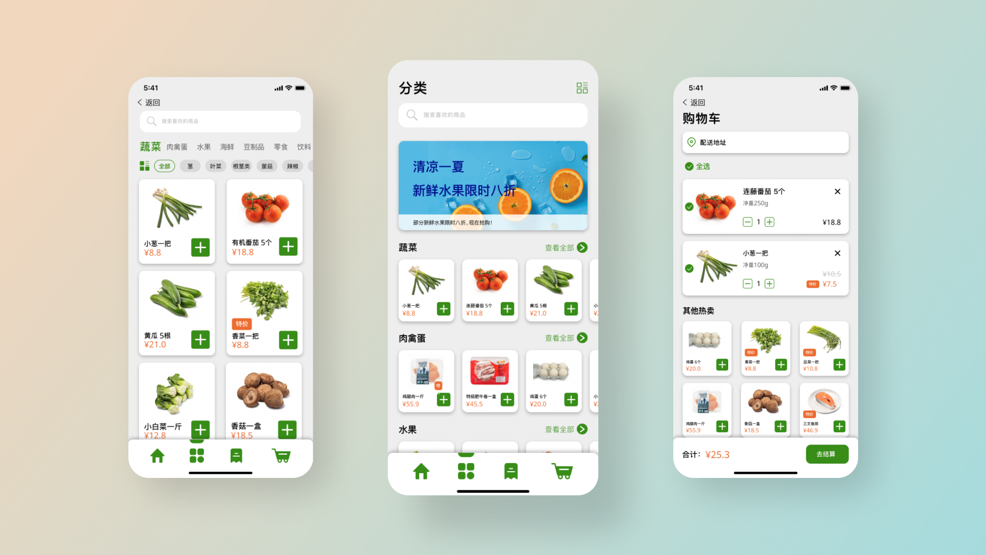
On the re-designed main page, users can now view different categories by scrolling vertically and reveal more items by scrolling horizontally. The design also reserved space for ads, while making sure that customers can browse items efficiently.
The product selection page features a new menu bar that consists of two separate menus. The menu on the top shows primary categories (e.g. vegetables, fruits, seafood) while the bottom menu displays sub-categories (e.g. leafy greens, root veggies, peppers). Both menus interact the same way; scrolling to reveal more contents and tapping to select.
To further provide clarity and ease of use, all categories are rearranged by popularity and all design elements and texts are left-aligned for a more intuitive reading experience.
Expanded View
Opportunity
About 18% of Near’s users are above 50 years old. During user research, users raised the need for more accessibility features.
Feature
Users can toggle between different grid views to see more items at once in a compact layout or browse content in bigger grids and larger text sizes.
Checkout
Opportunity
User research revealed that customers liked the previous checkout page for its simplicity. Some users mentioned that they would often forget one or two things after placing the order.
Feature
To lower the learning curve for users, the checkout page maintained the same layout as the previous interface. Additionally, I took the opportunity to add a product suggestion section to remind users of any items that they might have left behind while also providing the team a chance to promote any products that are on sale.
Responsive Design
Opportunity
About 10% of Near’s users come from web and tablet platforms. There is an opportunity to establish a responsive interface so that the app can work on different devices and screen sizes.
Feature
Although this was not a part of the main objectives of the project, I took the initiative to develop a mock-up to show that the design could be made responsive to different screen sizes. I also wanted to highlight and encourage future opportunities to include more accessibility features, especially for previously neglected demographics.
Interactive Prototype
Feel free to explore the prototype below, and please let me know if you spot any bugs or mistakes!
Product Outcomes
Some key metrics:
Since the release, the update has seen relatively rapid adoption. Over 67% of users opted in for the new interface
The conversion rate from ads increased by about 5%
The update received positive customer feedback
Additional wins:
Established a flexible design system to build on top of
Senior users especially appreciated the expanded view feature
The team continued to build more accessible features
Design Process
User Research
Research Insights
Throughout the project, I worked together with team members and stakeholders to make sure the design is in line with the project goals. These collaborations were essential to the success of the project.
For instance, I connected with the PM at the start of the project to align goals and expectations and arranged weekly check-ins with the team to catch up on project progress and gather design feedback. Below are snippets of conversations with my team that prompted some of my design decisions:
Collaborations
Design system
Wireframes
Next Steps & Reflections
From collaborating with teammates, I learned a lot of communication skills. For instance, having an initial conversation with the developer really helped me understand the technical constraints in this project
What did you learn from this project?
What else would you do if you had more time?
I want to add in a suggestion feature based on specific recipes, and even offer users recipe recommendations to help them decide what to cook


